

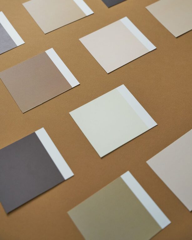
Choosing calm colors for your home can make each room feel more comfortable, balanced, and welcoming. Soft shades often help a space feel less busy, while carefully chosen deeper colors can add warmth and character without creating visual clutter.
The best calm color palette is not the same for every home. Natural light, room size, furniture, flooring, and personal taste all affect how a color looks. With a few simple guidelines, you can create a peaceful atmosphere that still feels interesting and personal.
Start With the Mood You Want
Before choosing paint or accessories, think about how you want the room to feel. Color can influence the overall impression of a space, so defining the mood first will help you narrow your options.
Consider words such as:
– Restful
– Warm
– Airy
– Natural
– Cozy
– Clean
– Grounded
– Quiet
For example, a bedroom may suit soft, muted colors that encourage relaxation. A living room might benefit from warm neutrals that feel inviting. A home office may look best with calm colors that provide focus without feeling plain.
Writing down two or three words that describe your preferred atmosphere can make the selection process easier.
Choose Soft, Muted Versions of Color
Bright colors can be attractive, but highly saturated shades may feel intense when used across large areas. For a calmer look, consider softened versions of your favorite colors.
Muted colors usually contain gray, white, brown, or another neutral tone. This softens the original color while preserving its character.
Examples include:
– Dusty blue instead of bright blue
– Sage green instead of vivid green
– Warm clay instead of strong orange
– Soft lavender instead of intense purple
– Pale olive instead of bright yellow green
– Blush beige instead of bold pink
These shades can add color without overwhelming the room. If you prefer a more neutral home, use muted colors as small accents through pillows, artwork, rugs, or curtains.
Try Natural Color Families
Colors inspired by nature are often easy to live with because they feel familiar and balanced. Look to the landscape around you for ideas.
Calm natural color families include:
– Sand, cream, and warm beige
– Stone, taupe, and soft gray
– Misty blue and blue gray
– Sage, moss, and muted olive
– Terracotta, clay, and soft brown
– Off-white and pale wood tones
Natural colors can be combined in many ways. A room with warm beige walls, light wood furniture, and muted green accessories may feel relaxed without appearing dull.
Pay Attention to Natural Light
Light has a major effect on how color appears. The same paint can look different in a bright room than it does in a shaded space.
Rooms with strong natural light may make colors appear lighter and more vivid. In these spaces, slightly deeper or grayer shades can help create balance. Rooms with limited light may benefit from warm, pale colors that reflect more light and help the space feel welcoming.
The direction of the windows can also influence the appearance of color:
– North-facing rooms often receive cooler, softer light.
– South-facing rooms usually receive warmer and brighter light.
– East-facing rooms are brighter in the morning.
– West-facing rooms receive stronger, warmer light later in the day.
Always test color samples on more than one wall. Look at them in the morning, afternoon, and evening before making a final decision. A sample that looks perfect in a store may appear different under your home’s lighting.
Build a Simple Color Palette
A calm room does not need to use only one color. The key is to create a palette with enough variety to add depth while keeping the overall look connected.
A simple approach is the three-color method:
- Choose a main color for walls or large surfaces.
- Select a supporting color for furniture, textiles, or built-in features.
- Add a small accent color for artwork, accessories, or decorative details.
For example, you might combine:
– Warm white, natural beige, and soft blue
– Pale gray, muted green, and light wood
– Cream, dusty rose, and warm brown
– Soft taupe, charcoal gray, and sage
– Light blue, off-white, and sandy tan
Use the main color across the largest area, the supporting color in medium amounts, and the accent color sparingly. This creates a sense of balance and prevents the room from feeling too busy.
Repeat Colors Throughout the Room
Repeating a color in several places helps the design feel intentional. If you use a muted blue in a rug, repeat it in a cushion, piece of artwork, or small decorative object.
The repeated color does not need to match exactly. Similar shades can work together as long as they share a related undertone. Repetition also helps connect different materials, such as painted walls, fabric, wood, and ceramics.
Understand Warm and Cool Undertones
Two colors may look similar at first but create different impressions because of their undertones. Warm colors often have hints of yellow, red, or brown. Cool colors may contain blue, green, or violet.
Warm neutrals, such as cream, beige, and soft taupe, can make a room feel comfortable and inviting. Cool neutrals, such as blue gray and crisp white, often create a cleaner and more spacious appearance.
Try to keep the undertones of large features reasonably consistent. For example, a wall color with a warm beige undertone may work better with warm wood floors and cream fabrics than with icy white furniture.
This does not mean every color must match perfectly. A little contrast can make a room more interesting, but too many competing undertones may make the space feel disconnected.
Consider the Existing Features
Before selecting a new color, look at the elements that will remain in the room. Flooring, countertops, cabinets, furniture, tile, and window treatments all contribute to the final palette.
Use these features as a starting point. If the room has warm wood floors, colors such as cream, olive, clay, and beige may coordinate naturally. If the space includes cool gray tile, consider blue gray, soft white, or muted green.
Create a small collection of samples, including fabric, flooring, and paint cards. View them together in the actual room. This can reveal combinations that are difficult to judge separately.
Use Darker Colors With Care
Calm color schemes do not have to be pale. Deeper shades can create a peaceful, comfortable feeling when used thoughtfully.
Consider using a darker color on:
– One accent wall
– Built-in shelves
– Interior doors
– Lower cabinets
– A small powder room
– Upholstered furniture
– Curtains or window shades
Deep olive, charcoal, navy, and warm brown can add depth while remaining restful. Balance darker colors with lighter surfaces, natural textures, and good lighting so the room does not feel closed in.
Add Texture Instead of More Color
If a neutral room feels too plain, adding texture may be more effective than introducing several new colors. Texture creates visual interest while keeping the palette calm.
Useful options include:
– Woven baskets
– Linen curtains
– Wool or cotton rugs
– Matte ceramic objects
– Natural wood
– Soft blankets
– Textured wall art
– Bouclé or nubby upholstery
Layering different textures allows a limited color palette to feel rich and complete. A room with cream walls can still have plenty of character through wood grain, woven materials, patterned fabrics, and varied finishes.
Avoid Choosing Too Quickly
Paint and decorating decisions are easier when you take time to observe the room. Begin with small samples rather than purchasing large quantities immediately.
Use this simple process:
- Collect several related colors.
- Place samples near furniture and flooring.
- Observe them under different lighting conditions.
- Remove colors that feel too bright, too dark, or too cool.
- Live with the remaining options for a few days.
- Choose the color that feels comfortable over time.
The goal is not to follow a strict trend. A calm home should reflect the way you want to live in the space. By choosing softened colors, considering lighting, coordinating undertones, and adding texture, you can create rooms that feel peaceful, welcoming, and easy to enjoy.